Creative Direction · Art Direction · Brand Identity · UX
Reposition the City of Austin's public-art initiative around the things that actually make it work: locality, wayfinding, and a real sense that the art belongs to everyone.
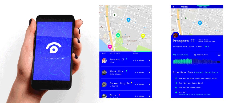
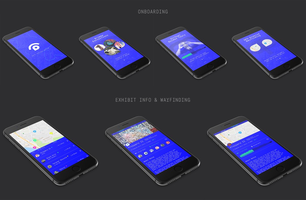
Public art is location-based by nature, so the identity had to call out to technology, wayfinding, and the connected, digital nature of the experience.
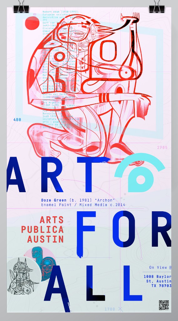
The first move was to simplify the rather long "City of Austin Public Arts Initiative" into something with more personality. Arts Publica was chosen for its associations with the communal movements of the local and national Latino community — a name that carries inclusion and an energetic, youthful spirit.
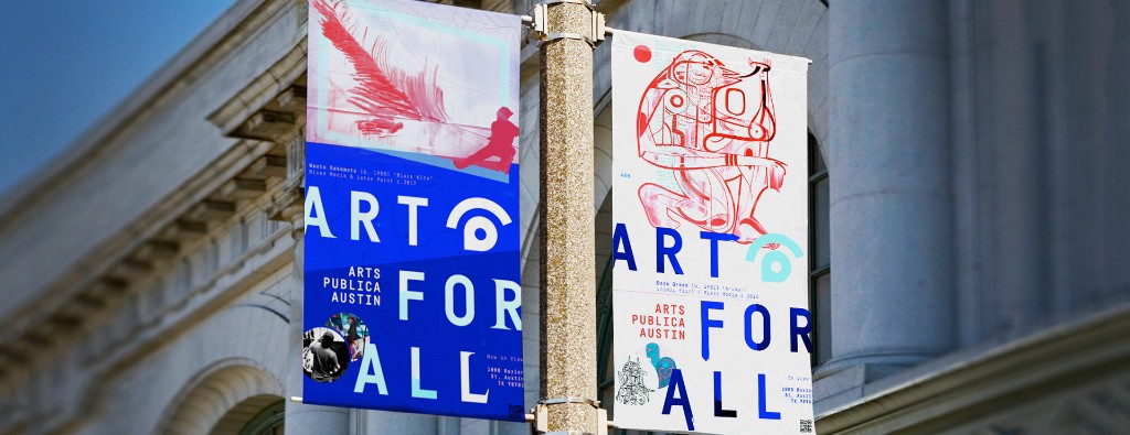
The mark and logo read two ways at once: as an eye (viewing) and as a destination point (wayfinding). There's an unpretentious sense of play in it — fitting for a platform whose whole argument is that art should be for everyone.
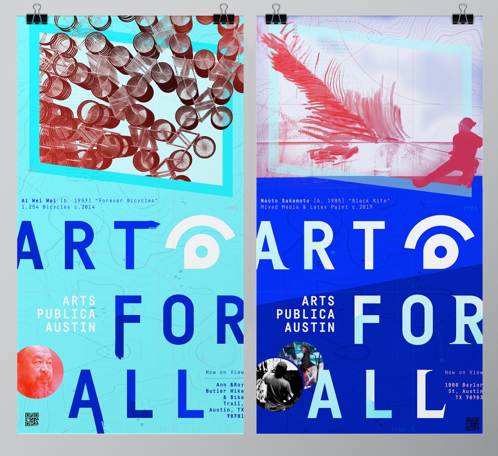
The platform stands on the belief that common places shape our lives, and art should be for everyone. In-situ large-scale environmental graphics, along with various artifacts spread around the city, reinforce the idea of public space as a gallery. The cumulative effect of placements, exhibition sites, and the brand itself is to blur the line between moving through the city and appreciating the work.
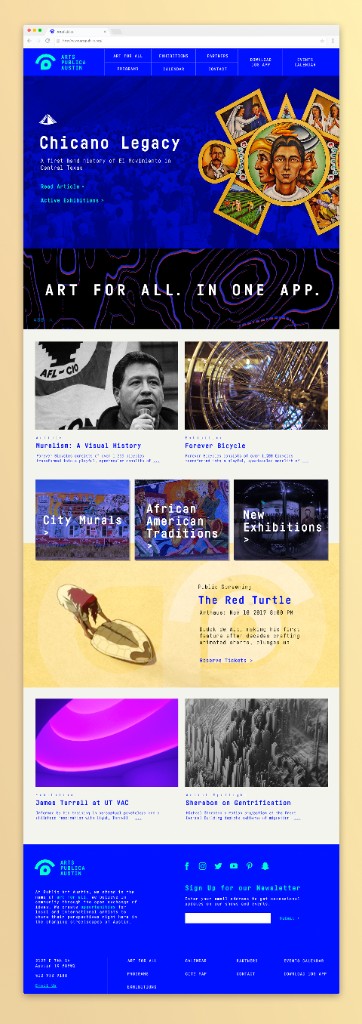
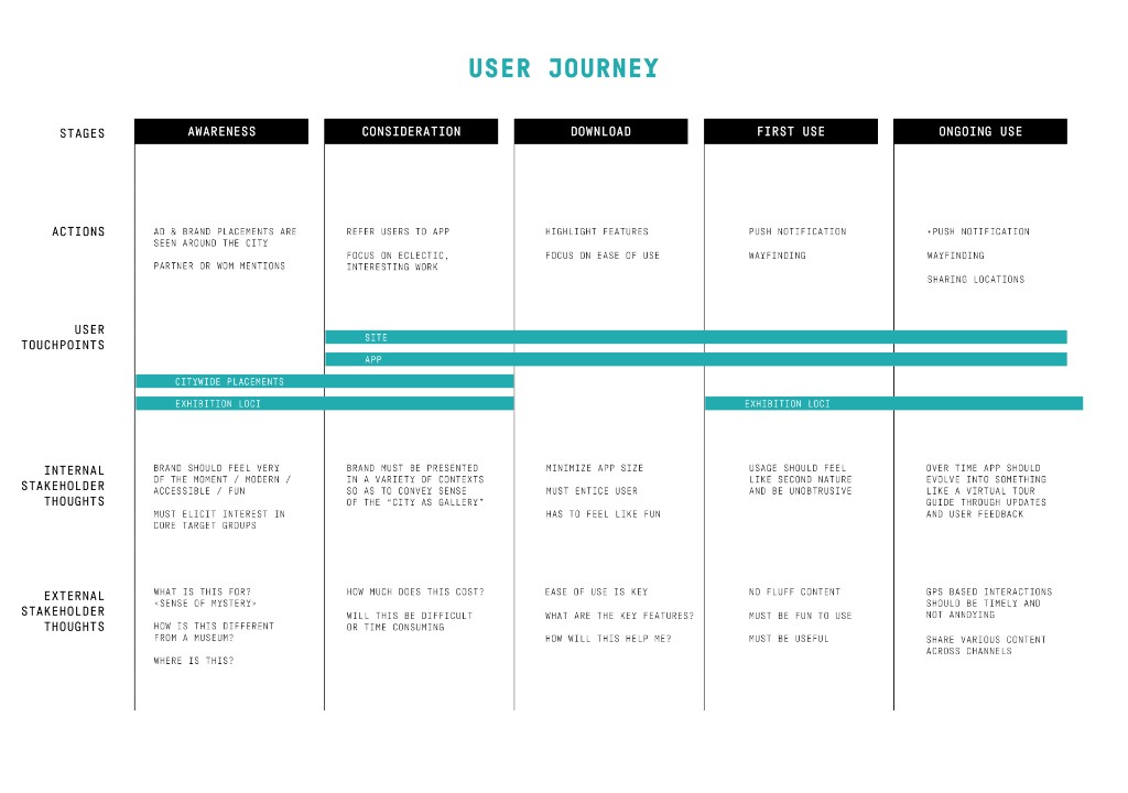
The website carried the calendar, exhibits, and artist information as the face of the initiative, and pushed traffic to the app. The app worked as a virtual tour guide: see every exhibition relative to your location, plan a day around several, and get a push notification when you're near a point of interest, with extra audio, video, and text for each location on view.